Evolution of a Cover: The Wicked King by Holly Black
By Karina Granda, Senior Designer
I am so thrilled with all the buzz around the cover for The Wicked King! Especially since the second book in a series can be more challenging than the first—and this one was no exception.
We were all smitten with The Cruel Prince, so the challenge was coming up with a cover that looked like part of the series, but could also stand out on it’s own. So when Holly told us this book would have an underwater element, we were excited, but also very aware of the challenge ahead.
How could we sink the crown, while still maintaining a bright white, crisp feel for the series?
Holly also let us know that there is only one crown in the series, so we would not play with different designs and color. So how do we make the same crown feel new all over again?
Our amazing cover artist, Sean Freeman, was up to the challenge!
We do not land this in one try:
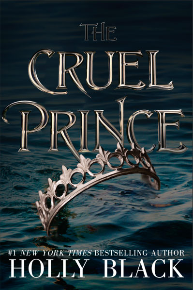
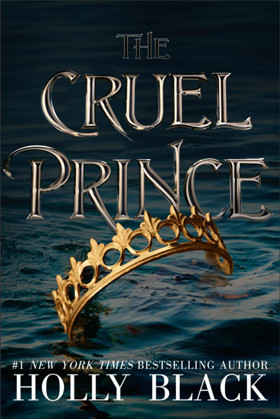
This image was beautiful, but quiet. We were looking for some energy and excitement! Also, we’d lost our crisp white background entirely, so it was starting to feel too different from The Cruel Prince.
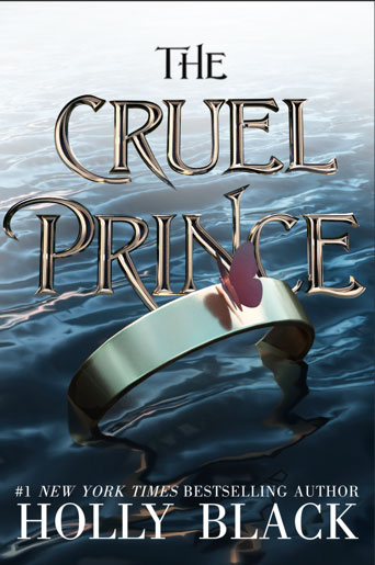
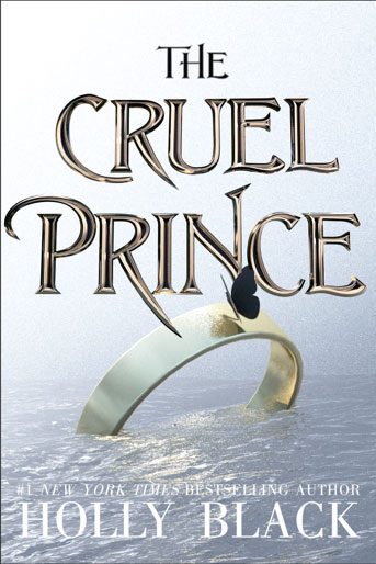
Adding a butterfly and a white highlight did not quite do the trick either. Though we did want a creepy crawler on this one too—like the beetle on The Cruel Prince!
So I started looking at A LOT of images of water.
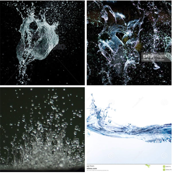
And it became clear that to bring some energy to this cover, what we needed was a splash! What if instead of a slow drown, the crown was plunged into the water?
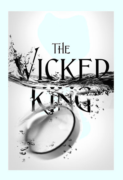
And suddenly we felt like we were getting somewhere.
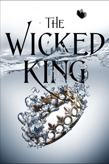
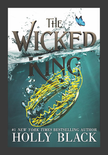
Just a few more turns of the crown… a little bigger and a little smaller…a little more or less gold… and A LOT more splash…
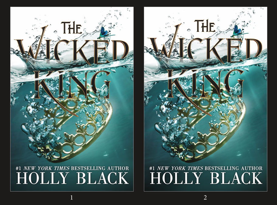
The enchanting and bloodthirsty sequel to the New York Times bestselling novel The Cruel Prince.


